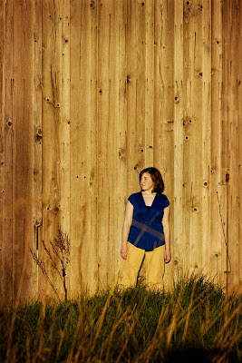
there are two pictures posted below. (actually two edits of the same picture.)
joel and i can't agree on which is better, so he challenged me to post them both to my various pic-posting sites, not specify which i like and which he likes, and see what y'all think.
i'm trusting in the artistic sensibilities of the internet, here - please let me know which one you like better - and please like the correct one!


click on either photo to view it larger


5 comments:
My fav is the color one. :) I like the matching pants, background, and grass that all ties the same color in. looks good! let's do some maternity pics at their place...I like what I see. :)
i like the color one, too. usually i'm a sucker for black and white (just always so cool), but in this case the color one is brilliant and i'm just drawn to it. sorry joel, or lani, whoever i'm disagreeing with:)
yeah... the color one definitely won the popular vote. i was going for the b/w, but i humbly conceed defeat. :)
Ok, here's my opinion... probably not very educated but my opinion nonetheless :) I prefer the color photo. In it, the color of the wall in the background matches the color of the straw that are sticking up in the grass. The one thing that throws me off is the color of her pants. I enjoy the contrast of her blue shirt with the wall, almost like the green grass contrasts with the straw(?), but the pants almost look like they're trying to match...I'm sure this is more in depth than you were looking for, but I also like how there is a fading on the edges of the wood wall in the photo... not sure if you purposely did vignetting or not. It looks very natural. I definitely love the composition though :) :)
hannah - that's totally what i was looking for! i agree with you about the color of the pants - that's one of the reasons i liked the b/w. i really like the pop of the blue as well, though.
the vignetting was on purpose - it's an action i have in photoshop and i LOVE it!
thank you SO much for the in depth interaction - it's so helpful!
Post a Comment